



When is bootstrap 4 coming up? Since August 10, 2017 Bootstrap 4 Beta is available. The new version of Bootstrap is now in beta and has a lot to offer. The change from Bootstrap 3 to Bootstrap 4 and the changes and new features are explained here.
Bootstrap 4 now sets to Sass, instead of Less as in the previous version.
A big change with Bootstrap 4 is the switch to the Flexbox model as default, many elements and components have been switched to this model. With regard to the Responsive Webdesign the Flexbox model offers many possibilities to display content optimized for each device.
Bootstrap 4 now uses rem instead of px as the primary size unit. However, media queries and the grid system are still defined with the old size unit and the default font size has been changed from 0.9rem(14px) to 1rem(16px). With rem and em as relative sizes, it is easier to make adjustments. Sizes can therefore be determined individually for each media query and thus facilitate the implementation of the Responsive Web Design.
The Apple operating system iOS 6 and the browsers Internet Explorer 8 and 9 are no longer supported. Bootstrap 4 only supports IE10+ and iOS 7+. Android v5.0+ and the latest version of WebView are now officially supported. Earlier Android versions are only unofficially supported.

| Chrome | Chrome | Internet Explorer | Microsoft Edge | Opera | Safari | |
|---|---|---|---|---|---|---|
| Mac | Supported | Supported | - | - | Supported | Supported |
| Windows | Supported | Supported | IE 10+ supported | Supported | Supported | Not supported |
| Chrome | Firefox | Safari | Android Browser & WebView | Microsoft Edge | |
|---|---|---|---|---|---|
| Android | Supported | Supported | - | v5.0+ supported | - |
| iOS 7+ | Supported | Supported | Supported | - | - |
| Windows 10 Mobile | - | - | - | - | Supported |
3.1 Tables - More specific classes for tables
The new class .table-inverse describes a table with a dark background.
and bright writing. To halve the spacing between the contents the class .table-sm can be added (formerly .table-condensed). All context classes such as .active or .success must now be prefixed with .table-, i.e. the class .active must become .table-active.
The child selector > was removed as far as possible, so that now also nested
tables inherit the properties of their parent elements.
The class .table-responsive is now placed directly on the table and not on a new div element around the table.
Furthermore, there is a new class for the table header .thead-inverse with the same appearance as the inverted table. The class .thead-default represents a table header with a slightly darker background.
3.2 Typography - More possibilities, better separation between markup and design
The known smaller and weaker text sections of a heading need the <small> tag as usual, but now also the utility class .text-muted.
Furthermore, from now on there are more classes (display-1,...,display-4) available for headings, which should stand out due to a larger and thinner display.
Text fields also get a responsive part. From .text-{left,center,right} you can now make .text-{sm,md,lg,xl}-{left,center,right}. The adjustment applies to the specified size and all sizes above it, unless another class is entered.
Block quotes always need the class .blockquote in the new version. The block quote Footer must be identified with the class .blockquote-footer.
Inline lists have the class .list-inline as usual, but the entries must be extended with the class .list-inline-item.
3.3 Images - There will be a life after img-responsive
The known class .img-responsive is replaced by .img-fluid. The image classes
.img-rounded and .img-circle, were replaced by the classes .rounded and .rounded-circle.
is replaced.
For SVG images in Internet Explorer 8 and 9, disproportional scaling may occur, in which case you must add width: 100% \9;.
Images with the property display: block; can be centered using the helper class .mx-auto. Images without this property can be positioned using the float and text alignment helper classes (Utility Classes).
3.4 Figures - Finally also in Bootstrap
To display images with captions there is the well-known <figure> tag, Bootstrap version 4 now also provides special classes for <figure class="figure">, <img class="figure-img"> and <figcaption class="figure-caption">. With further helper classes the appearance and the alignment can be defined.
Much has changed in the area of components, several components have been omitted or have been combined to form a new component (e.g. cards). Furthermore, some components have been extended and improved.
The Affix-Plugin was completely removed, that means you have to work with position: sticky or other external libraries now.
Furthermore, the glyphicons will no longer be available as a free icon package in Bootstrap 4. A good alternative is FontAwesome, which offers a much larger icon base and many similar icons.
4.1 Buttons - Finally Outline Buttons
Outline button styles are now available for each context class. For these the class .btn-primary is replaced by the class .btn-outline-primary. With the outline buttons the font color (color) and the border are color-matched and as hover effect the buttons are filled and the font color white, like with the normal buttons in the normal state.
The class button-xs is no longer represented by default and the class .btn-default has been renamed to .btn-secondary.
The jQuery plugin button.js has been removed (methods $().button('reset') and $().button('string') are no longer available), but checkboxes, radio buttons and the toggle function have been kept.
4.2 Cards - wells and panels become cards
Cards are the new components that replace the previous "Thumbnails", "Panels" and "Wells". The 3 components were removed or combined to the component Card. With modifier classes, functionalities of the old components can be used again.
An outer div element with the class .card forms the container of the component. This component can also be extended by helper and context classes such as .card-inverse, .card-primary, .card-outline-danger, .text-center and .mb-2.
Predefined contents:
div.card-header → header line
div.card-footer → footer
img.card-img-top/bottom → Picture up/down
img.card-img + div.card-img-overlay → Wallpaper
(+ .card-inverse on the card, for light writing with dark picture)
div.card-block → Content container
h*.card-title/subtitle → h*-Elements for Title and Subtitle
p.card-text → simple text elements
a.card-link → Text links
blockquote.card-blockquote → Quote
ul.list-group.list-group-flush → list
(.list-group-flush removes double margins)
li.list-group-item → Lists Entry
Cards are combined with the container div.card-group with the Flexbox model to a uniform group of cards of the same size and width.
The container div.card-deck leads to the same result, but here the
Spacing between cards not removed. A Masonry layout is obtained by enclosing the cards with a container div.card-columns. The column-count property can be used to determine the number of columns for different media queries. With this variant, the cards no longer get the properties of the Flexbox in order to be better ordered. The arrangement is from top to bottom and from left to right.
4.3 Figures - More control, more classes
Almost all > selectors were replaced by unnested classes of elements. E.g. .nav navbar > li > a becomes individually addressable .nav, .nav-item and .nav-link.
The navbar itself finally gets a class for the screen break: .navbar-toggleable-{breakpoint}. Now you can determine when the break to the burger menu should happen.
.navbar-default now becomes .navbar-light, .navbar-inverse keeps its name. What is new, however, is that these classes no longer have any influence on the background color, but only on the font color. Also margin-bottom and the border-radius have been removed.
The background can therefore be determined. For this the classes for Background-color can be used: .bg-{primary,inverse}.
.navbar-toggle becomes .navbar-toggler, has other styles and no longer uses the three <span>s but a .navbar-toggler-icon.
Navigation forms (.navbar-form) were completely replaced by .form-inline, which can now be used everywhere.
5.1 Grid - Another distinction for smartphones
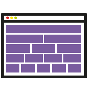
A new level has been added to the grid. It replaces the xs and applies to screens smaller than 576px wide. As a result, all other levels are moved up one level (.col-lg-{size} is now .col-xl-{size}).
| Extra small <576px | Small ≥576px | Medium ≥768px | Large ≥992px | Extra large ≥1200px | |
|---|---|---|---|---|---|
| Grid Behaviour | always horizontal | At the beginning "Collapsed" then horizontally after the break point | At the beginning "Collapsed" then horizontally after the break point | At the beginning "Collapsed" then horizontally after the break point | At the beginning "Collapsed" then horizontally after the break point |
| Max. Container Width | None / auto | 540px | 720px | 960px | 1140px |
| Class Prefix | .col- | .col-sm- | .col-md- | .col-lg- | .col-xl- |
| # of columns (col's) | 12 | 12 | 12 | 12 | 12 |
| Column Spacing Width | 30px (15px on each side) | 30px (15px on each side) | 30px (15px on each side) | 30px (15px on each side) | 30px (15px on each side) |
| Collapsible, Offsets, Columns Order | Yes | Yes | Yes | Yes | Yes |
For the smallest level (xs) the classes .col- are used, not as assumed .col-xs-. Another new feature is that there is no need to append numbers to classes on columns of the same width. The width depends on the number of columns and is defined by the Flexbox model. If a column is specified with a fixed size (.col-{breakpoint}-{size}), the remaining space of the row is distributed equally to all other columns.
Thanks to the Flexbox model, the rows can be aligned vertically with respect to the parent element via .align-{start,center,end} and the columns via .align-self-{start,center,end}. The classes .justify-content-{start,center,end,around,between} are used for the horizontal alignment of the contents of the rows. The helper class .no-gutters (applied to the row) removes the outer distance of the row (margin-right/left) and the inner distance of the columns (padding-right/left).
Furthermore, the grid modifiers push,pull and offset were changed from .col-{breakpoint}-{modifier}-{size} (.col-sm-push-3) to .{modifier}-{breakpoint}-{size}- from the former notation .col-{breakpoint}-{modifier}-{size} (.col-sm-push-3). (.push-sm-3) shortened.
The classes .col-{breakpoint}-auto cause a width of the columns adapted to the content. For example, single-line, horizontal contact forms can be displayed as flexible and balanced as possible. To start a new row you can insert a div element with the helper class .w-100.
The mixins make-col and make-col-span have been combined to make-col to ensure that predefined classes and mixins have the same properties.
The classes .pull-left and .pull-right have been renamed and are now called .float-{sm,md,lg,xl}-{left,right,none}.
5.2 Media Object - Here must be adjusted
The class .media-object is dropped, i.e. images(<img>) or links (<a>) now need a different property (some browsers do not handle inline elements according to the Flexbox model (see Flexbugs). Therefore it is recommended to apply the helper class .d-flex to the element. With further Helper classes (Utility Classes) distances and alignment can be determined. Spaces are necessary because of the missing .media-right and .media-left classes, which were used in bootstrap 3 with spacers between the elements.
The class .media-heading is also omitted, a possible class with the same effect (set distance up to 0) would be .mt-0. With .mb-{size} you can set an individual distance downwards.
Furthermore the class .media-list is replaced by the helper class .list-unstyled.
5.3 Responsive Utilities - Different but more practical
The new declarations make media queries much shorter and simpler. Now @include media-breakpoint-up/down/only/between is possible, e.g. for all screens from 576px on @include media-breakpoint-up(sm){...} is used. The predefined grid breakpoints and container widths are now defined with $grid-breakpoints and $container-max-widths, which means there are no more variables and the @screen-* variables are completely omitted.
The classes .hidden and .show have been removed due to conflicts with the jQuery methods $(...).hide() and $(...).show(). These effects can now be achieved by inline style properties (style="display: none;" or style="display: block;" ) or by toggle insertion/removal of the class .invisible. The classes .visible-{breakpoint}-{style}, .visible-{breakpoint} and .hidden-{breakpoint} are now realized via .hidden-{breakpoint}-{up,down}. It is no longer specified on which size something is displayed, but on which sizes it is not.
.visible-* → .hidden-sm-down.hidden-xl-up
6.1 Border - Finally full control over the frame
The frame of an element can easily be defined. The class .border-0 removes the border completely, or .border-{top,right,bottom,left}-0 removes the border on the specified side. There are also new classes for the border radius: .rounded gives the element slightly rounded corners. By .rounded-{top,right,bottom,left} you can determine the side where the roundings occur. For example, with rounded-top, the upper left and upper right corners would be rounded. With .rounded-circle the element is rounded circularly. If there should be no rounding, this can be determined with .rounded-0.
6.2 Flexbox - We were skeptical, but convinced that the rounding was correct
In most elements, the representation as Flexbox is already determined by the element-specific classes. There are further helper classes for your own Flexbox containers. To call the properties of a Flexbox, use the classes .d-flex or .d-inline-flex, for different breakpoints there are .d-{breakpoint}-....
The classes .flex-row and .flex-row-reverse help with a horizontal alignment of the Flexbox elements, where the elements are displayed in normal order or in reverse order.
For vertical alignment there are .flex-column and .flex-column-reverse. As with the first helper classes, these classes can also be defined for each breakpoint (.flex-{breakpoint}-...).
Breaks are defined with .flex-wrap or .flex-nowrap.
Sorting of the elements is possible by the classes .flex-first and .flex-last.
6.3 Display properties
The CSS commands for display: {block,inline-block,inline} were transferred to classes .d-{block,inline-block,inline}.
6.4 Responsive embedding
The new class .embed-responsive allows <iframe>, <embed>, <video> and <object> responsive to be embedded. In addition, the class .embed-responsive-{21by9,16by9,4by3,1by1} must be inserted for the different aspect ratios. The classes belong to a <div>, which is placed around the element. The element itself gets the class .embed-item.
6.5 Screenreader - Accessibility is even better supported
The already known class .sr-only gets an additional class .sr-only-focusable, which makes the element visible again by focus. For example by pure keyboard users. This can also be used by the mixins @include sr-only and @include sr-only-focusable directly in Sass.
6.6 Size determination - No JavaScript solution required anymore
With the classes .w-{25,50,75,100} the width, in percent, of the element (relative to the higher element) is determined. With .mw-100 the maximum width can be set to 100%.
Likewise, .h-{25,50,75,100} and .mh-100 can be used to adjust the height equivalently.
6.7 Spacing - We always missed that
Margin and padding can now also be represented by classes.
They are specified with .{property}{alignment}-{wrap}-{size}.
The specified breakpoints always specify the min-width. With xs the break is omitted: .{Property}{Alignment}-{Size}.
Property describes Margin and Padding which are only described with the first letter.
Alignment is specified by t for top, b for bottom, l for left, r for right, x for left and right, y for top and bottom or blank for all four pages.
The size can be any number. This is multiplied by the variable $spacers.
This means:
.{Property}{Alignment}-{Wrap}-{Size}
.{m,p}{t,b,l,r}-{,{sm,md,lg,xl}}-{1,2,3...}
Horizontal centering can be determined by the class .mx-auto.
Bootstrap 4 looks very promising and already usable.
At the moment we would not recommend it, but it can change every day.
Please contact us to find out if Bootstrap can help your project.